How do I represent an idea, an attitude, and a lifestyle with a single identity? How do I capture the essence of what we are, and what we want to do with color, shape, typography, and imagery? Most importantly, how do I make sure I don’t fuck this up?
These were the questions I kept asking myself when Bluebird was simply a concept in our minds. We had a plan, we knew what we wanted to do with this company. We knew we wanted to help people avoid feeling like shit when they were on vacation in Colorado, but we didn’t know what any of it looked like. That was my job. No pressure, right?
This is typically the most difficult moment in a process for any designer. You have a blank sketch pad, an empty Figma file, you’re staring at your hands, waiting for good ideas to start flowing out of you. But what if they don’t? This isn’t designer’s block, it’s worse. This is anxiety.
In my opinion, the best thing you can do in this moment of all-encompassing fear is to breathe. Have a cup of coffee. Sit with your dog. Do something that slows your mind down a bit and start to try and catalog what you want this brand to feel like. A few things I asked myself in the beginning were:
- Is my brand trendy? Is it professional? Is it fun?
- Is my brand loud? Is it humble?
- If my brand was a physical object that I could hold in my hand, would it be warm? Is it cold? Could I break it with two fingers? Is it made of metal? Wood? Is it soft? Sharp?
- Most importantly, when I’m finished, what types of emotions do I want our users to feel when they see Bluebird?
I know these questions sound a bit abstract, but understanding the actual feeling of what you’re beginning to create is the foundation of everything to come. Think of this almost as a written mood board for your brand. Once I had some of these questions answered, it was a bit less daunting to start sketching out ideas for our mark.
The Mark
Full transparency, the infancy is ugly. Very ugly. This isn’t a dribbble post on my glorified graph paper sketch pad that’s been redrawn 27 times to appear as though this is how you get it right the first time. The truth is, sketching isn’t supposed to look nice, it’s simply an idea primer. Let it be ugly, wear that as a badge of honor, and know it won’t be ugly forever. Sketch on a napkin, a sheet of crumpled-up printer paper, a whiteboard, anywhere that’s convenient. Just start sketching to get anything that your mind might have absorbed from the questions you answered above. Most importantly, don’t throw anything away.
Here are my earliest scribbles:
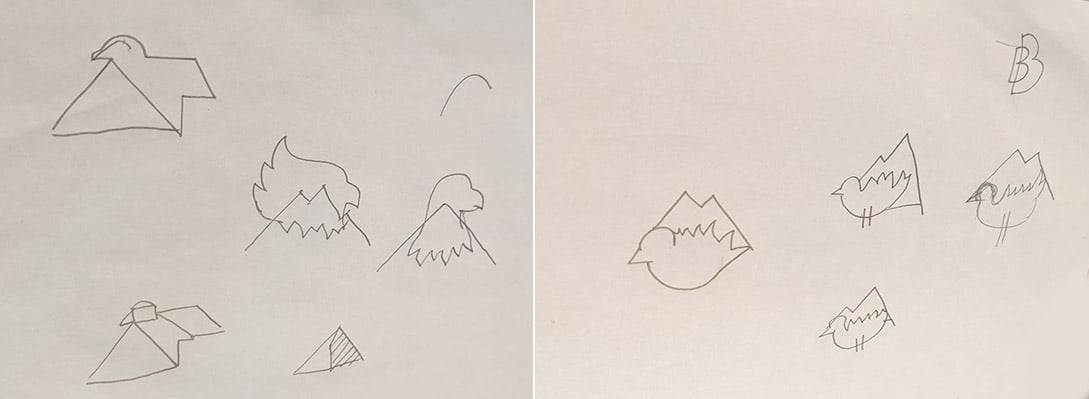
There were various other sketches, but I’ll spare you those. At this point, I hopped into Figma and did similar sketching digitally.
From here, I felt like I was maybe onto something. I started refining my sketches a bit more into crude illustrations and attempted to pair them with typography. For me, there’s no science behind choosing a typeface that fits your brand. I tend to go by feel. Candidly, sometimes it feels like I’m feeling around for my keys in the dark. Once I had a general shape for the mark, I began tabbing through 100’s of typefaces, switching them in real-time to see if anything struck me as close.
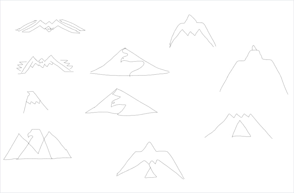
Here’s a midway point through that process:
At this point, I decided out of all the various sketches, I’d pick the one I felt was the strongest and had the most potential. From there, I shifted gears into refinement mode, which typically see-saws between overcomplicating an idea and backing up to try and re-simply it. This process went on for a week or so.
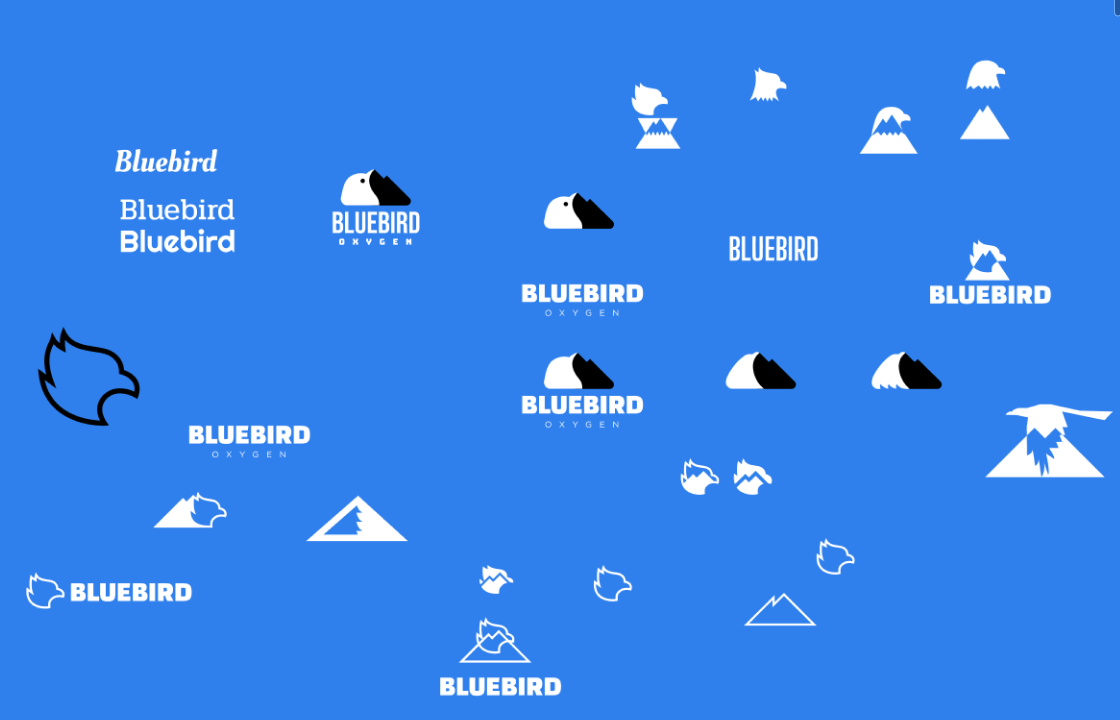
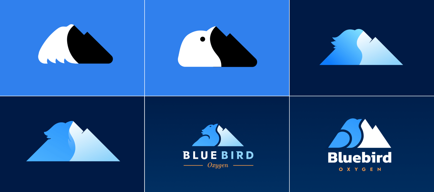
Here are a few key variations:
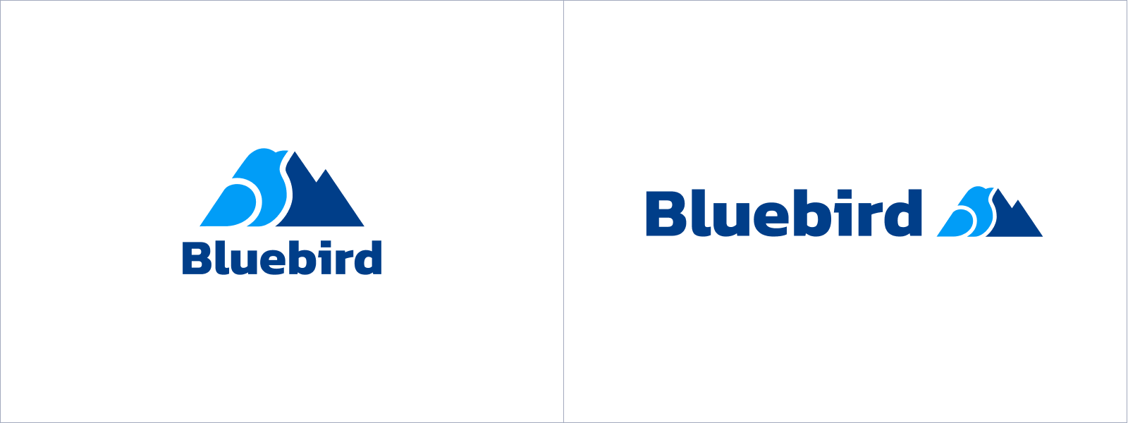
The final mark:
Worth noting, I didn’t do this in a vacuum. Don’t be afraid to show your iterations to people who have fresh eyes. My team here at Bluebird saw every iteration and sketch, providing feedback along the way. Many spouses and children also gave their input and every bit of it is valuable. Sometimes it’s difficult to see if something feels off when you’re so close to it.
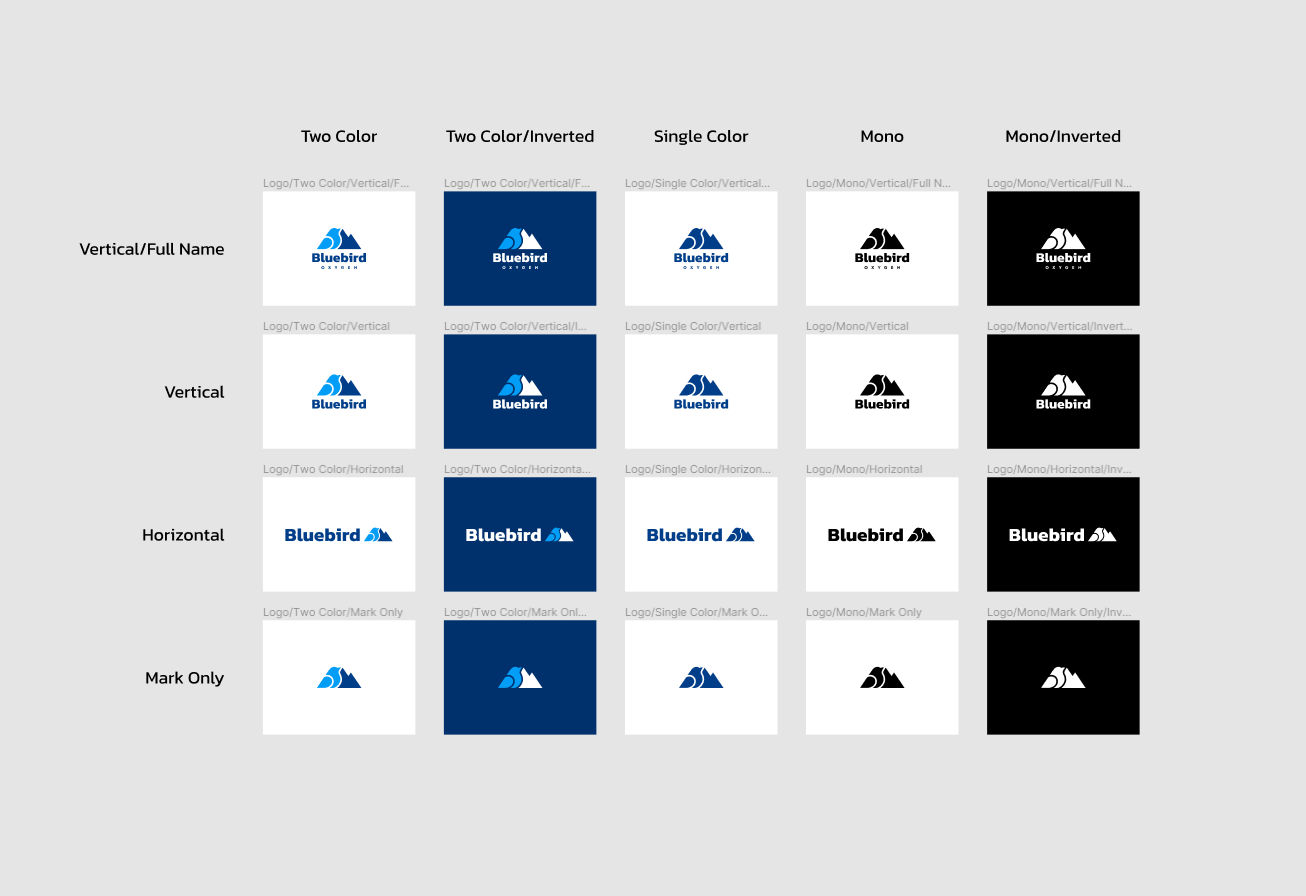
I put together various color combinations for several different applications across web, clothing, and print collateral. Phew, big sigh of relief.
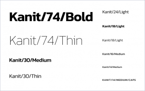
Typography
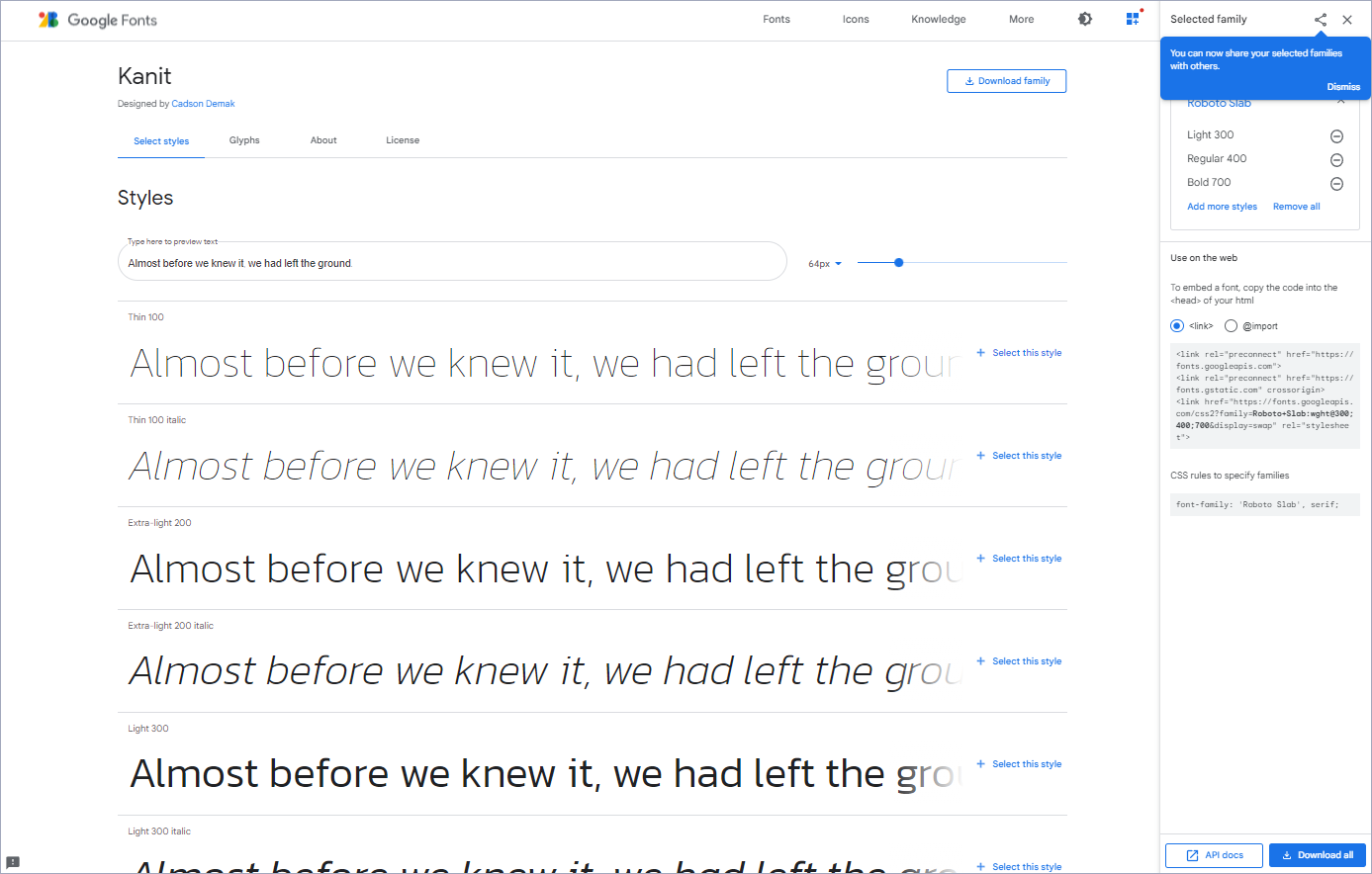
As I mentioned before, there can be a bit of overlap between creating a mark and pairing typography with your brand. These things happened in tandem for me, but ultimately my choice of using the typeface Kanit was a combination of its modern aesthetic, its versatility, and its availability.
Availability is so important and often overlooked. Kanit is a free open source typeface hosted by Google inside of Google Fonts. Because of this, we owe no royalties, and we have an abundance of font weights and styles. Google Fonts integrates seamlessly with web applications and is extremely simple to implement. I highly recommend entertaining the idea of choosing an open-source typeface. It’s a huge creature comfort.
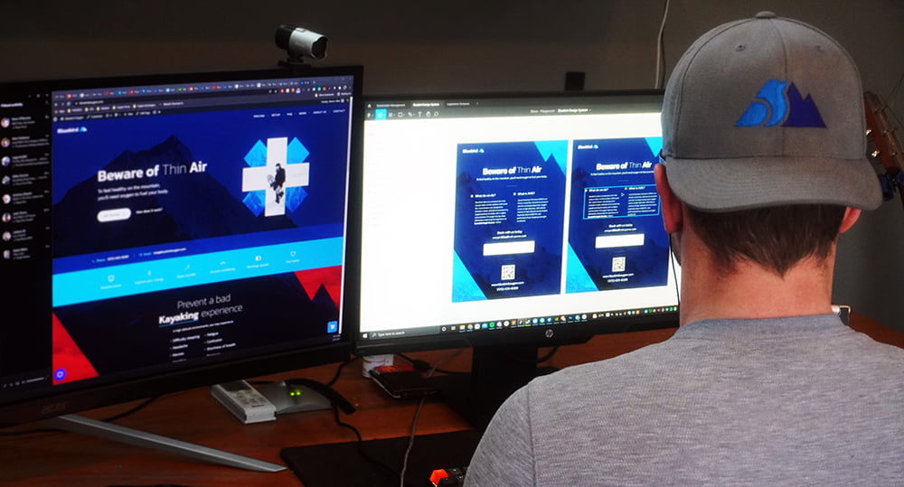
Creating a typography hierarchy was my next task. I did so during the design iterations of the website and integrated it into the design system which I created in Figma (I’ll get into design systems in a later post). Having a range of weights and sizes at your fingertips is a great way to maintain readability and scannability across pages on your site. Having rules for these in a design system also promotes consistency and allows for less design improvisation when you’re designing and building new pages. Do your best to stick to the rules you set up, but don’t be afraid to change them globally if they aren’t working the way you had imagined.
Color
Arguably the most striking and visceral component to any brand; the color palette. I knew fairly early during my logo exploration that I wanted to use a variety of cool colors including vivid blues and slate grays as my primary palette with a potential for expandable accent colors as needed. What I’ve learned throughout my design career is that it’s easy to go a little crazy creating multiple variations and shades of different core brand colors and it can quickly become a tangled mess. Inevitably you’ll accrue design debt and introduce inconsistencies across your platforms and products. I think it’s best to try and stick to your guns and keep your palette simple with only a handful of colors, trying to keep the deviations when possible to a minimum. Here’s my core palette for Bluebird:
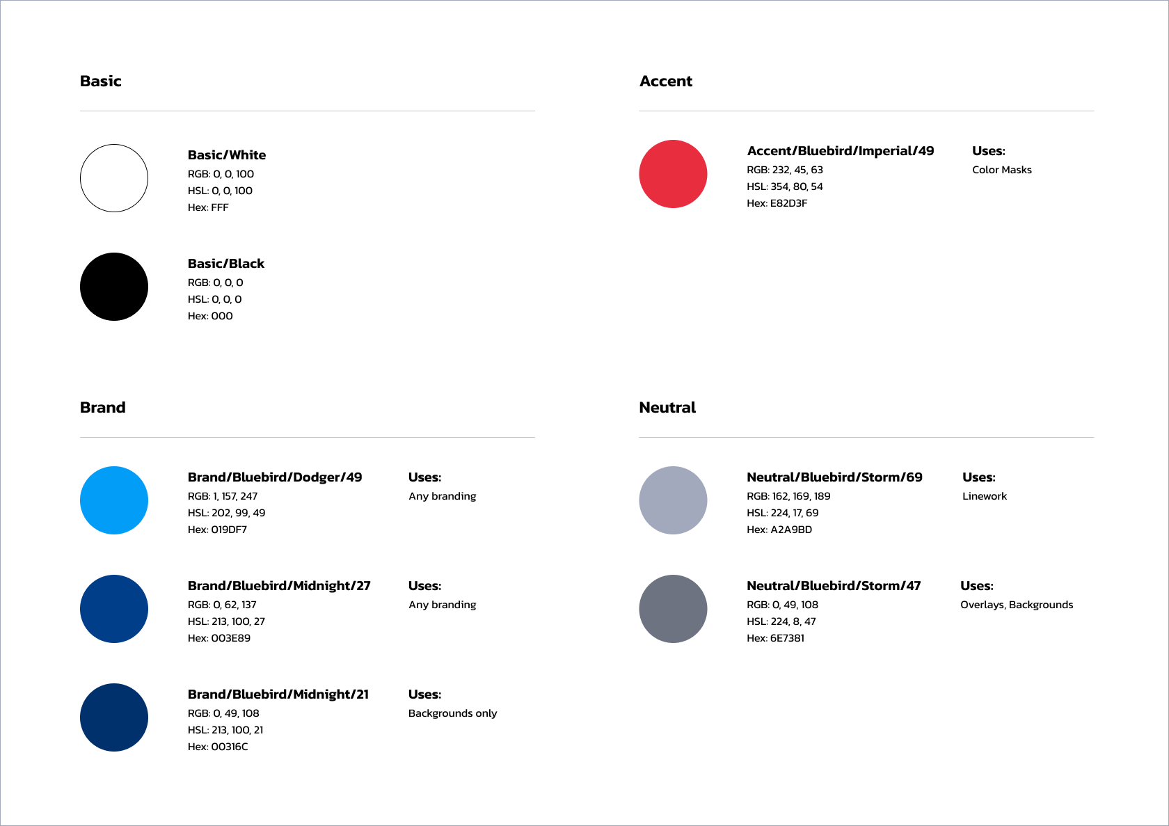
At first, color naming may seem trivial, but I see it as a fundamental component to having an efficient palette, especially when you get into front-end architecture and variable naming. I think we’ve all been guilty of this at some point:
- Blue
- BlueLight
- BlueLighter
- BlueLightest
- BlueLighterest?
When naming colors, I tend to avoid using the actual color as its name (i.e. blue, red, green), but rather, I choose a memorable name that represents how the color family looks to me. This way, you can have multiple different families of a certain color (say, blue) without worrying about them crashing into each other.
For example, with Bluebird, we have two core brand blues: ‘Dodger’, and ‘Midnight’. I’m willing to bet you could pick which is which, without any clues:

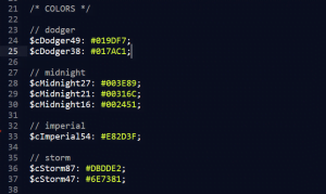
Beyond that, when I have different variations of a color family, I append a lightness value to the end of the color name to indicate which is which. This avoids the “light, lighter, dark, darker” issue I mentioned above. As a bonus, many front-end developers use HSL (hue, saturation, lightness) as a color profile in front-end development, so this is a great way to keep variable names in line with their actual values.
Take a quick peek at my color variables for bluebirdoxygen.com:
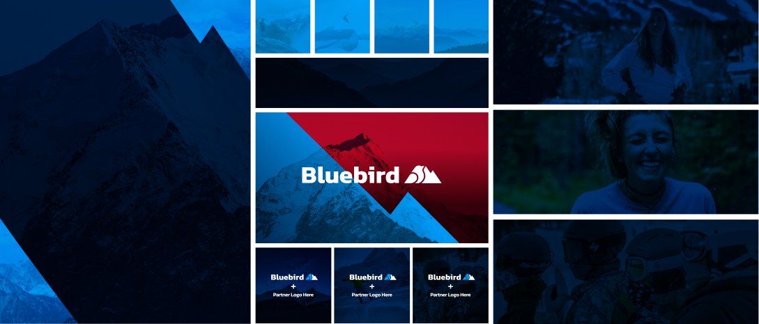
Imagery
Another powerful way to convey emotion within your brand is through imagery. Imagery works similar to color, shape, and typography but can deliver an even stronger message when paired correctly with other elements of your brand. If a user sees someone getting enjoyment in the context of your product or service, they will more easily connect that emotion with your brand and message. In the context of Bluebird, we operate entirely in high-altitude environments, which are visually breathtaking. Showcasing these visuals reminds the user of why they love skiing, hiking, or whatever activity they are looking to enjoy in Colorado. In our case, we are encouraging our users to embrace that love, as we at Bluebird share the same passion for outdoor activities in high-altitude environments.
In closing
Building a brand from the ground up has its challenges, but taking it one step at a time and trying to avoid becoming discouraged is half the battle. At the end of the day, we’re designers because we love to communicate and educate users on why we believe a particular idea, product or service is meaningful. In my journey with Bluebird, I’m still as excited as ever to continue improving our brand and informing outdoor enthusiasts why oxygen supplementation is so important for having a great experience in high-altitude environments.

